Dairy Queen

DQ Frozen Treat Packaging
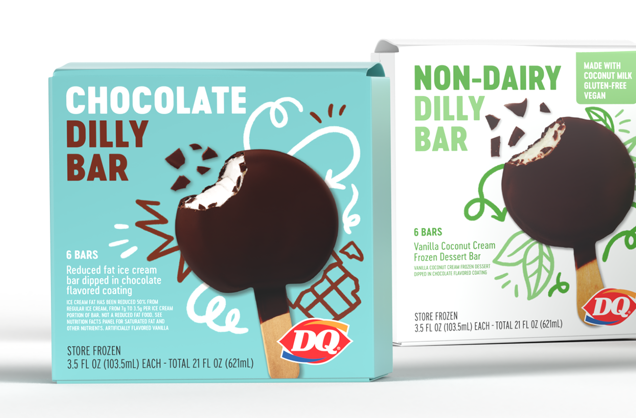
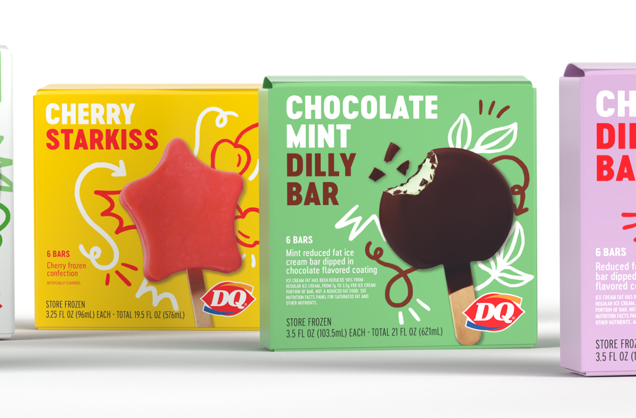
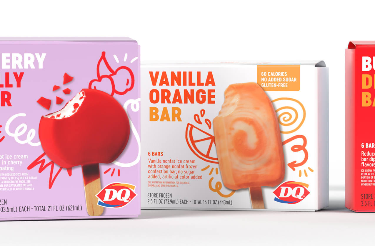
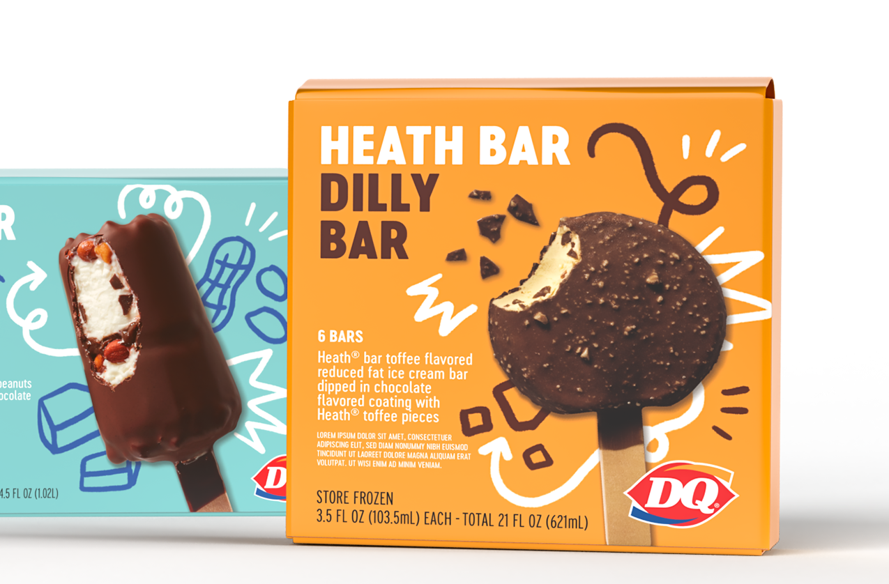
Dairy Queen has been serving up classic treats since 1965 and I had the unique opportunity to rebrand the whole family. Illustrations are inspired by the product’s crunchy coatings, smooth creamy insides, and tasty flavors. The packaging embodies the first bite experience that sparks a feeling of joy in all of us.


DQ MLB Partnership
This summer, DQ is partnering with the MLB to give Fans a taste of major league happiness to remember. The campaign toolkit and cup packaging celebrate the classic pastime while remaining own-able to the DQ brand


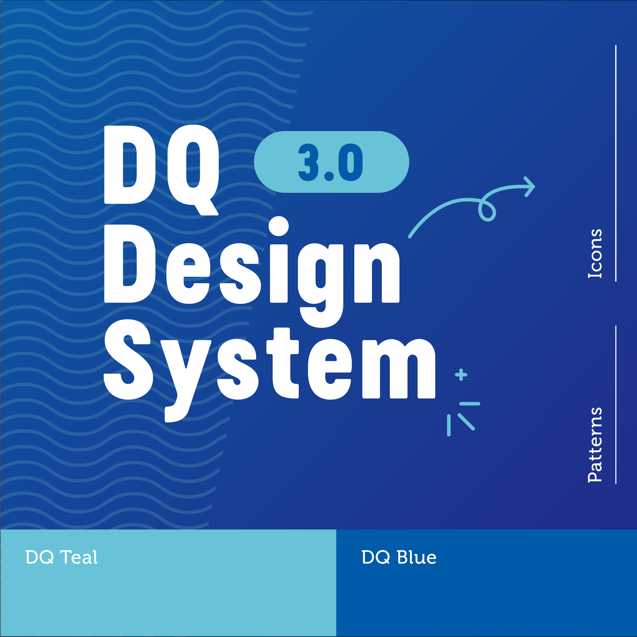
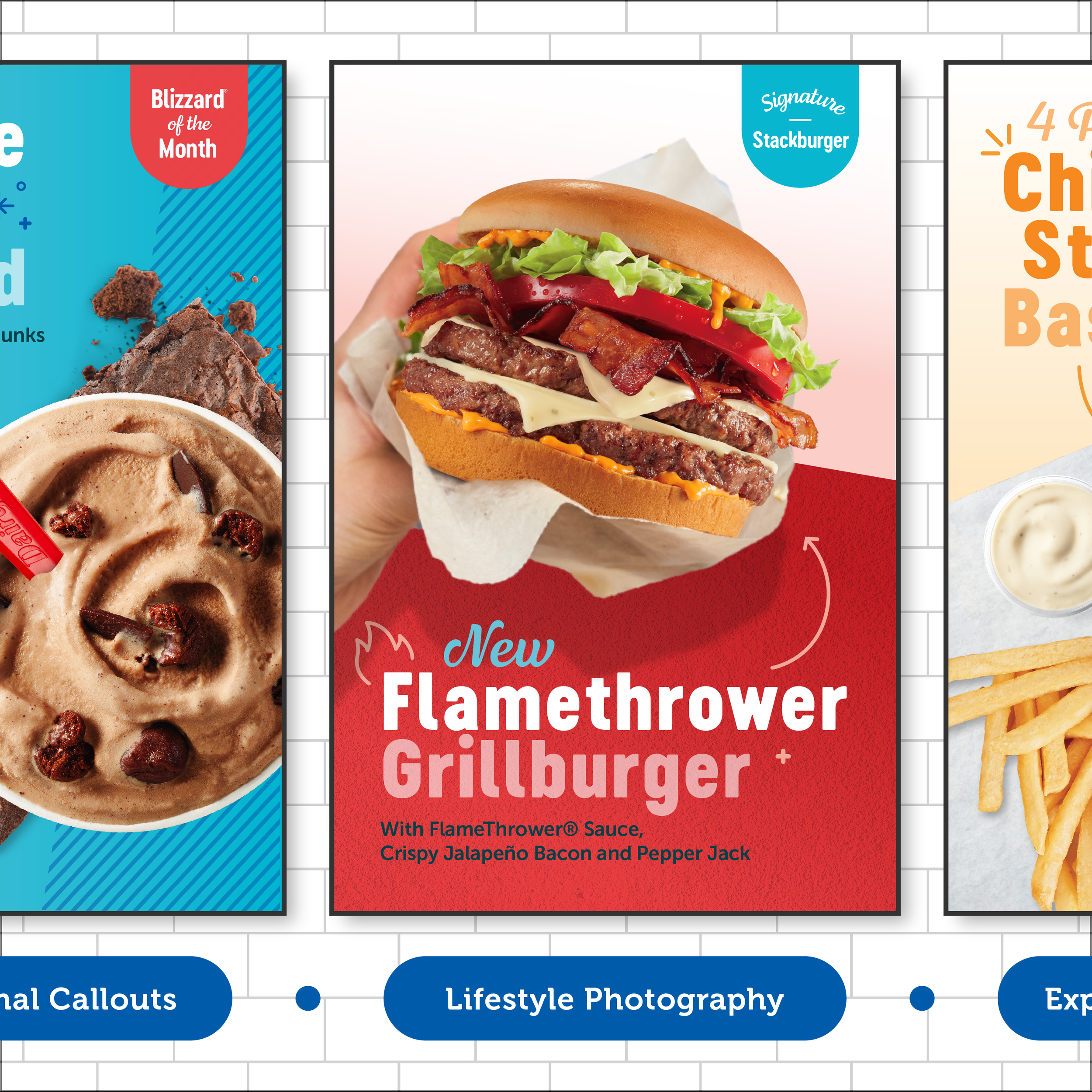
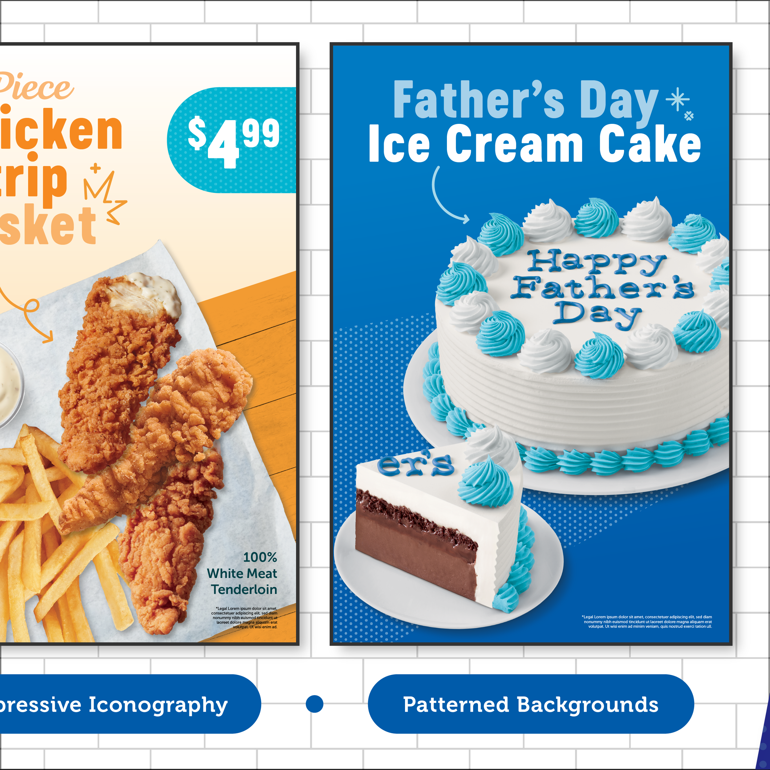
DQ 3.0 Design System
In a competitive set that pushes the same reds and yellows, DQ owns their teal-centered, simplistic system that perfectly complements their treat offering. But how do you expand a unified but restrictive system to support their entire food offering while still feeling like DQ? We diversified color by bringing their iconic logo palette into the fold, flexed the system by adding playful iconography and patterns, and simplified hierarchy by freshening up type treatments. All of which deliver on our brand strategy, Happy Tastes Good.